
Imagine that your business has just submitted a sample dataset to us for a free test of our APIs for validation, cleansing, and categorization. What you receive in return is not just a list of validated entries, but a comprehensive summary report. This blog post introduces you to the power of these summaries, demonstrating how they not only refine your data but also provide actionable insights. Here we will explore how a test batch summary can give you insight into how to use your customer data most effectively.
A Guided Tour of Your Test Batch Summary
This summary report offers a high-level overview of your data, showcasing insights into data quality, validity, and categorization, all accompanied by dynamic visual representations and detailed explanations. These summary reports are provided to you via a URL that you can freely share with your internal team.
The heading of your test batch summary will give you an overview of the service and operation you are testing – this makes it simple to understand the exact functionality you tested. This heading also provides context to others who may have not been involved in the testing process, making it a breeze to relay important features to your internal team.
Along with the service overview, your sales representative will add their feedback on the test performed, with insights specific to your use case. This heading also includes a snippet of an AI-powered analysis – the AI system is trained with context of the service features and fed statistics about your data and asked to make an educated extrapolation of the quality of your data.
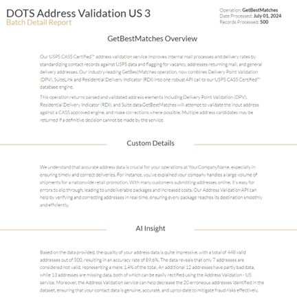
Next, your summary report will include dynamic charts, graphs, and maps that illustrate key takeaways from your processed data. For example, the chart below shows the breakdown of DPV (Delivery Point Validation) scores for a sample dataset.
From this chart, you can immediately see that 448 of the 500 sample addresses are valid and deliverable, with the remaining 52 addresses having a mix of being undeliverable, missing information, or throwing an error (likely along the lines of “Address not found”). Along with the DPV breakdown, we also report on all of the USPS and other relevant flags for the address – such as it being a residence, high rise/apartment building, on a military base, etc.
Instead of digging through a spreadsheet to make your own analysis, the summary can provide you with the most important takeaways from your data.
Another example of powerful graphics from the test batch summaries are the dynamic maps. These maps can show you a physical distribution of your data along with key features of the data. For example, the map below shows you the DPV scores of sample addresses in California, distributed by county. When you hover over the different counties, you get the specific DPV distribution of that county. This type of graph shows you how granular you can get with the data returned by our services.
See For Yourself
Test batch summaries are just the first step in harnessing the power of your clean and validated data. Reach out to us today for your own test batch and summary based on your company’s needs.